Welcome to Paper Trail

Hello and welcome to Paper Trail! When we decided to work on a second demo, we thought that since the first twenty scenes were out in the open, we wanted to be more transparent on what we’re working on since there isn’t as huge a worry in regards to spoilers right now. Paper Trail is what we came up with to make our process as clear as possible.

Typically, our blog posts are fairly decent in size, wrapping our general progress up in a neat little package. Paper Trail is the quicker, maybe a little messier, alternative. This allows all of the devs to make small, informal blog posts about whatever it is they’re working on: scrapped content, drafts, or maybe just WiP-related doodles. Content can be rough and lack polish, but using this method allows us to share stuff in the pipeline immediately. If you’d rather wait for more polished information and updates, our regular blog will be continuing it’s normal updates.

We think this’ll be a fun, interesting way to keep you updated. Hope you enjoy it!

→ read more

Eileen's easy to understand once you get to know her

This is just a small thing, got some feedback that Eileen’s name was a bit hard to read. If there’s any other names that you found a bit difficult to read at a glance gimme a heads up and I’ll look into it.

→ read more

Join the Writing Club

This isn’t really an update on progress, but I thought it’d be fun to share. If you poked around our source code at all, you might’ve spotted some cut content, including this poster.

Originally, the plan was for both the writing and art club to have posters that would gradually fill up some of the campus backgrounds (hallways, etc) as the demo period passed, building up to the club day scene, which we’ve been using as our “mascot” moment, included on the front page of our site and so on. The idea ended up being scrapped before it left the concept phase. 

We did plan to keep the poster after that, introducing it in a manner similar to the art club, but I thought it was odd how Caprice and Mekki were at odds with each other and yet it seemed like their designs came from the same source, most likely an art club member who obviously wouldn’t want to help Mekki recruit for her club. The art club poster ended up staying in the demo build, while we replaced Mekki’s with her handwritten note, which still conveyed all of the necessary information. It also helped us seperate Mekki and Caprice just a tiny bit more; Caprice would keep the art club a secret from Oliver and tease him with it, whereas Mekki would be direct and personally invite him. <div> </div><div>

Just some small dev insider stuff that I thought would be neat to share, since the poster was left inside our source. On the subject of the club posters though, we know some people thought the art poster looked awkward since the designs themselves were painted over while the text wasn’t. It’s a small thing, but it’ll be fixed in the second demo. </div>

→ read more

Presenting Choices

WiP’s been built up with the decision that we wouldn’t really look at other VNs for inspiration. In some cases, we’re actually going out of our way to break typical VN presentation styles to make things pop a bit more. Since I do UI and stuff I’ll be talkin’ specifically about choices and what we’ve decided to do with them.

Choices in VNs are typically shown in really long rectangles with a short sentence or description of what you’re getting into, in it’s infancy, WiP adopted that as well.

It’s simple and effective. We never really saw the actual need to replace it, but it always seemed pretty bland to me. That, coupled with the fact that we deliberately wanted the first choice in the VN to be memorable and important, I decided to tinker around with ideas. You’ve already seen what we ended up with:

We originally intended the first choice to be a special case, we’d have a special choice box for it and then default to the traditional rectangle choices. However, the end result of the new choice box really left an impression on us for two reasons:

  1. You were able to get as much information from it’s visual elements as you were able to from the text portion
  2. It allowed users to interact with the world in a very small but cool feeling way (camera panning)

It also ended up feeling a lot more organic than a typical text box, since it was tailored to fit it’s specific choice. Prior to the demo being released, we were debating going all out and making unique choice boxes for every last choice in the VN. Given the positive feedback we received about it from the demo, we decided to go ahead with that. They won’t all be like scene 20’s choice, but they will all take inspiration from it. No solid examples to show yet cuz we’re busy buildin’ new stuff, but just so you know “a billion different choice boxes” is on my to-do list. I’m sort of worried we might be overstepping a little and trying to re-invent the wheel but if our wheel doesn’t end up being perfectly round in the end at least it’ll hopefully look nice!

→ read more

Presenting Choices, Pt 2

A while ago, I mentioned that I wanted to create unique choice prompts every time we deemed a choice necessary. While this is definitely doable, there was some talk in the team about how that would make the less significant choices seem more important than they actually are, and I also personally had some concerns that by trying to be unique I would end up grasping at straws in an attempt to make every choice a special snowflake. So, a compromise:

While every choice box will continue to be made by hand out of necessity, smaller choices will follow the format and style seen in the video, with higher-impact choices being unique. I still want choices to not drown you in wordswordswords, giving you just enough to know what you’re doing and I also want them to visually look interesting, and I think this solution will satisfy those.

→ read more

Professional Ideas Guy

Apart from general UI stuff, I get asked a lot about what I do on WiP. It’s hard to put into words without really sounding pretentious or useless really. While some on the team would claim I actually run the project, I’d personally specify that my job is to be an arrogant brute butting heads with anyone who I personally feel isn’t living up to the standards I expect for the project, hoping that they yield before I do. Prior to the demo being released, I was arguing for several days over things like how the characters in scene twenty should be SITTING as opposed to STANDING and after I won that argument we had another one immediately after about the angle of the tables that sit on the layer above the character sprites. Not to imply that the team is prone to taking shortcuts of course, working with this team has been absolutely amazing in terms of people setting their sights high and not settling for less.

There are three things I prioritize when looking at development, both from organizing as well as actually creating assets myself: consistency, equality, and acknowledging the medium that we’re using. While some/most/all(?) of this is common knowledge I’m sure, I’ve had the itch to actually push some kind of paper trail myself lately so I’m gonna run thru how I approach those three pillars and why I think WiP will stand out from others by taking these things to heart.

Consistency is the big one. The HUGE one. It’s something that consistently makes people flip between liking how the project is going and hating my decisions almost instantly. WiP has, for the entirety of it’s dev cycle, been run with a skeleton team. We’ve been very vocal about the pride we have by using only the bare minimum team to get everything done. When we have taken new blood in, it’s either been out of necessity (mudnut recently had to resign as our full time musician since he hasn’t had time to produce content, though he’s still on the team in some capacity so we had to bring in musician applicants) or if the new help wouldn’t immediately be visible on the surface but would undoubtedly help the quality of the VN (Skrats for example, is a dedicated redliner. While you won’t see his work in the VN, his influence will be present in every single art asset in the VN.) Consistency doesn’t just apply to art either—the tone of the writing has to match the visual identity of the vn, which has to match the genre of music, which has to match the tone of the writing. The entirety of the VN is being written by Mehkanik, and he’s kept on a very tight leash when it comes to consistency in the writing. If a character is acting in a way that contradicts the visual or audio presentation, he gets an earful. We don’t namedrop real people or brands, or make up cheap parody imitations. Even the UI itself was designed to have a personality. This focus on consistency comes with problems, however. If something is suddenly only “good” by our current standards that content will be entirely redone; we’ve thrown the entire VN out the window numerous times. Most recently, I got some nasty glares when I suggested completely throwing away all of mudnut’s music when it was revealed that he wouldn’t be able to work on music consistently anymore and that we’d probably need a new composer. With mudnut still on the team and composing it became a non-issue, but it was a move I was more than willing to make even if it set us back months, all for the sake of having the music be as consistent by possible, created only by active members of the team.

Equality, unlike consistency, is a lot more simple. People like to ask things like “when making a VN, what’s most important?” The answer, as far as I’m concerned anyway, is that you have to treat every single asset of development as if it’s the most important thing. You can have a VN with passable programming, passable art, passable music and rely on your narrative to carry your VN. You CAN choose to take that risk, but it really is much easier to give every part of the VN the same amount of respect and care instead of fretting where to put your attention. Don’t ever think it’s okay to put emphasis on one aspect over the other: as a developer you should want the ENTIRETY of your VN to shine the brightest it can, and you want to work with a team that feels appreciated and important.

VNs are weird, and it takes a certain mindset to adapt to them, or at least it took me a while. Like any other medium in order to actually be successful you need to take the position of your audience rather than just a creative vision making a thing that you like. If I’m reading a VN, I’m either going to be doing it at my desktop or maybe in a chair with a laptop, it’s not something you can necessarily pull out and read with the convenience of a book or even play with the convenience of a gaming handheld (mobile ports notwithstanding, I’m not sure if WiP will be taking that approach yet, will have to double check with Shiz later). The entirety of WiP’s presentation is built around this assumption. In our first iterations we had a very washed out color scheme, with pastels and bright colors while the sprites themselves were considerably darker. While that style still looked OKAY for what it was, swapping over to the brown and tan color palette made the entire VN easier on the eyes. It’s considerably less busy, and you don’t get tired looking at it. Our music is a lot more minimalistic than some piano pieces and melodies you may be used to in VNs just because we don’t really WANT our music to stand out to you while you read through—it’s best taken in as background noise, something pleasant but not in your face, distracting you from all the 
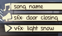
words and stuff. The UI has large buttons and focuses a lot on minimal words and visual cues. It also fits the aesthetic and stands out visually while not being distracting. Designing your presentation around the idea that people will actually be reading your VN in a certain way sounds like common sense, but (personally speaking) it’s something that a ton of people either don’t account for or fail at conveying.

Sorry for sounding pretentious and drowning you with walls of text, but to be honest I’ve been trying to put this into words for myself for a while as well, so this was a good chance to get it all out so I know where I lie myself.

→ read more

WiP Design Guide

I’ve had a text-only version of WiP’s design doc for a while, decided to make a visual version to make things easier to read through specific things. Here’s a few pages (thanks to Curchack for the cover image!)

Cover

Page 1

Page 3

Page 4

→ read more

Twofold logo

Here’s a screenshot of my messy unorganized doc where i was roughing out twofold logos. It was hard breaking outside of the box that st and wip established, but as soon as i opened up to the possibility of actually USING COLORS THAT WEREN’T TAN it pieced together almost instantly

→ read more

Style Guide Preview (2018 ed)

you guys remember paper trail? me neither

→ read more

A quick UI thing

hiya! another papertrail post, act surprised. this time around i wanted to show off a small little ui feature that wasn’t available in our super old demo. so, we’ve posted screenshot previews of both first snow and twofold. these are all wildly out of date (we’re pretty bad about maintaining our actual web pages….we’ll get to that eventually, probably once actual dev on fs winds down a bit….) but one thing youve undoubtedly noticed is that the text boxes are entirely different colors. i’ve had a couple people ask if we were replacing the old demo colors entirely, or if the blue version was an fs-exclusive thing or what have you. in actuality, twofold takes place over the span of two seasons, fall and winter, and the color of the ui changes to reflect that. naturally, first snow takes place ENTIRELY in winter, so it’s the blue textbox for the entire time.
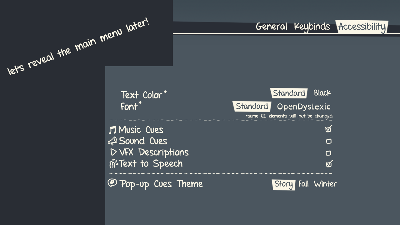
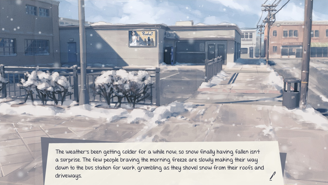
however, options are good! we’ve added a new thing to our menus, allowing you to choose between fall or winter themes manually.

the first option, “story” is the default; this just means that the textbox will change automatically based on story progression. in first snow this is effectively just choosing “winter”, but we’re leaving it in currently just for the sake of being consistent with twofold. this may change for the full release though.
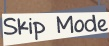
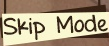
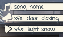
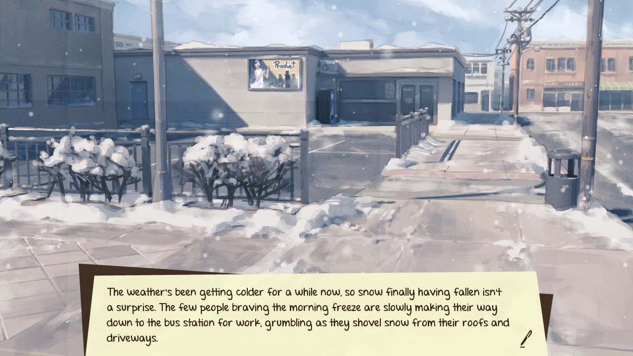
the fall ui! obviously, text and icon colors change as well. on top of that, other elements displayed “in-game” such as the skip mode, choice boxes, etc, will be color coded too. the main menu will stay consistent, though. we want those to be special for both VNs.


that’s about it as far as this update goes, but it’s nice to show off small things like this occasionally.

→ read more

Another quick UI thing

Howdy howdy! If you haven’t been following us on our Twitter, we’ve been posting screenshots of FS monthly. this month, instead of that, I thought it might be nice to present some mock-ups for some ui stuff.

Okay, so keep in mind that, as of right now, this is all 100. unfinalized. Some features listed here may not be there at launch, and vice versa. Furthermore, icons in the below screenshot are missing and/or are subject to change, we’re entirely placeholder right now! That being said, we’re currently looking at adding some accessibility options to first snow:

main menu

Pardon the mess! we wanna hold off on showing off the proper main menu for a little while longer, so please try and understand. ANYWAY, since this hypothetical accessibility tab is being worked into an already-existing UI on a relatively tight schedule, it’s not as fleshed out as it could be, but we hope that these options will be able to help people regardless. Right now, we ~believe~ these features should be relatively easy to add in under our current time constraints, and we hope to deliver them all.

One thing that i want to clarify is the last option here. The pop-ups in question are these lil’ things that should show up on-screen when music changes, a sound effect plays, etc.

pop-ups

If you scroll down a little to the previous papertrail post, you’ll note that the textbox has two different themes. While we use this as an immersion tool, we also let people pick which one they prefer to use manually. Because of this, we look at them as pseudo-low/high contrast themes. Ideally, we’ll be able to make the accessibility pop-ups separate from the textbox theme, allowing you to choose one or the other based on the ease of your personal readability.

fall screenshot

Okay, that’s about it! If things change in regards to our accessibility offerings, we’ll make sure to say something (on twitter, most like) as things develop so you know what to expect. this has been repeated a lot, but once more: right now, this is all subject to change, so please keep tempered expectations until we can finalize these decisions! Thank you for continuing to follow us and the development.

→ read more