Presenting Choices
WiP’s been built up with the decision that we wouldn’t really look at other VNs for inspiration. In some cases, we’re actually going out of our way to break typical VN presentation styles to make things pop a bit more. Since I do UI and stuff I’ll be talkin’ specifically about choices and what we’ve decided to do with them.
Choices in VNs are typically shown in really long rectangles with a short sentence or description of what you’re getting into, in it’s infancy, WiP adopted that as well.

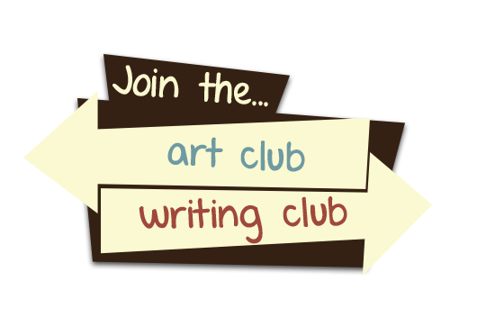
It’s simple and effective. We never really saw the actual need to replace it, but it always seemed pretty bland to me. That, coupled with the fact that we deliberately wanted the first choice in the VN to be memorable and important, I decided to tinker around with ideas. You’ve already seen what we ended up with:

We originally intended the first choice to be a special case, we’d have a special choice box for it and then default to the traditional rectangle choices. However, the end result of the new choice box really left an impression on us for two reasons:
- You were able to get as much information from it’s visual elements as you were able to from the text portion
- It allowed users to interact with the world in a very small but cool feeling way (camera panning)
It also ended up feeling a lot more organic than a typical text box, since it was tailored to fit it’s specific choice. Prior to the demo being released, we were debating going all out and making unique choice boxes for every last choice in the VN. Given the positive feedback we received about it from the demo, we decided to go ahead with that. They won’t all be like scene 20’s choice, but they will all take inspiration from it. No solid examples to show yet cuz we’re busy buildin’ new stuff, but just so you know “a billion different choice boxes” is on my to-do list. I’m sort of worried we might be overstepping a little and trying to re-invent the wheel but if our wheel doesn’t end up being perfectly round in the end at least it’ll hopefully look nice!

I loved the choice box for Scene 20, the design and the camera pan I felt made the decision actually *feel* important, not just *be* important. The camera pan especially added a nice flavour to it because, as you said, it allowed the reader to interact with it in a small way.
That being said, in my opinion (which you can obviously ignore if you so choose) the grandeur, or lack thereof, of the other choice box designs should be equivalent to the importance of the choice itself. Obviously I don't know what other choices are gonna be in the game, but I'm willing to bet that Scene 20 was one of, if not the biggest, decision that Oliver will face this semester, so a minor choice probably won't be as grand.
You guys probably already have thought about and discussed this, but I just wanted feel helpful by throwing my two cents in since I can't really do much else.
Can't wait for a full release though!