Professional Ideas Guy
Apart from general UI stuff, I get asked a lot about what I do on WiP. It’s hard to put into words without really sounding pretentious or useless really. While some on the team would claim I actually run the project, I’d personally specify that my job is to be an arrogant brute butting heads with anyone who I personally feel isn’t living up to the standards I expect for the project, hoping that they yield before I do. Prior to the demo being released, I was arguing for several days over things like how the characters in scene twenty should be SITTING as opposed to STANDING and after I won that argument we had another one immediately after about the angle of the tables that sit on the layer above the character sprites. Not to imply that the team is prone to taking shortcuts of course, working with this team has been absolutely amazing in terms of people setting their sights high and not settling for less.
 There are three things I prioritize when looking at
development, both from organizing as well as actually creating assets myself:
consistency, equality, and acknowledging the medium that we’re using. While
some/most/all(?) of this is common knowledge I’m sure, I’ve had the itch to
actually push some kind of paper trail myself lately so I’m gonna run thru how
I approach those three pillars and why I think WiP will stand out from others
by taking these things to heart.
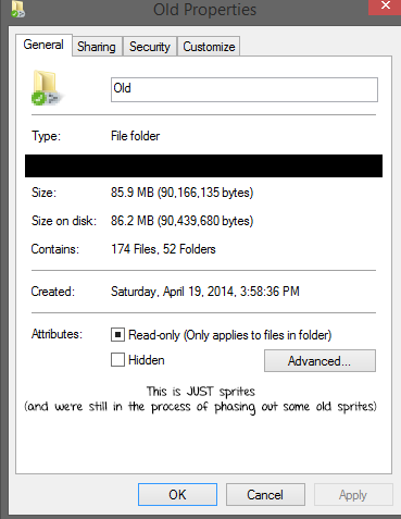
Consistency is the big one. The HUGE one. It’s something that consistently makes people flip between liking how the project is going and hating my decisions almost instantly. WiP has, for the entirety of it’s dev cycle, been run with a skeleton team. We’ve been very vocal about the pride we have by using only the bare minimum team to get everything done. When we have taken new blood in, it’s either been out of necessity (mudnut recently had to resign as our full time musician since he hasn’t had time to produce content, though he’s still on the team in some capacity so we had to bring in musician applicants) or if the new help wouldn’t immediately be visible on the surface but would undoubtedly help the quality of the VN (Skrats for example, is a dedicated redliner. While you won’t see his work in the VN, his influence will be present in every single art asset in the VN.) Consistency doesn’t just apply to art either—the tone of the writing has to match the visual identity of the vn, which has to match the genre of music, which has to match the tone of the writing. The entirety of the VN is being written by Mehkanik, and he’s kept on a very tight leash when it comes to consistency in the writing. If a character is acting in a way that contradicts the visual or audio presentation, he gets an earful. We don’t namedrop real people or brands, or make up cheap parody imitations. Even the UI itself was designed to have a personality. This focus on consistency comes with problems, however. If something is suddenly only “good” by our current standards that content will be entirely redone; we’ve thrown the entire VN out the window numerous times. Most recently, I got some nasty glares when I suggested completely throwing away all of mudnut’s music when it was revealed that he wouldn’t be able to work on music consistently anymore and that we’d probably need a new composer. With mudnut still on the team and composing it became a non-issue, but it was a move I was more than willing to make even if it set us back months, all for the sake of having the music be as consistent by possible, created only by active members of the team.

Equality, unlike consistency, is a lot more simple. People like to ask things like “when making a VN, what’s most important?” The answer, as far as I’m concerned anyway, is that you have to treat every single asset of development as if it’s the most important thing. You can have a VN with passable programming, passable art, passable music and rely on your narrative to carry your VN. You CAN choose to take that risk, but it really is much easier to give every part of the VN the same amount of respect and care instead of fretting where to put your attention. Don’t ever think it’s okay to put emphasis on one aspect over the other: as a developer you should want the ENTIRETY of your VN to shine the brightest it can, and you want to work with a team that feels appreciated and important.
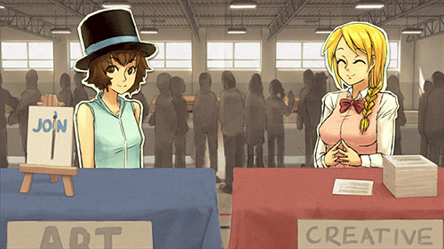
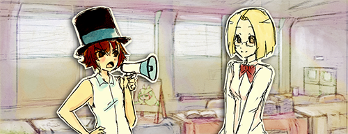
VNs are weird, and it takes a certain mindset to adapt to them, or at least it took me a while. Like any other medium in order to actually be successful you need to take the position of your audience rather than just a creative vision making a thing that you like. If I’m reading a VN, I’m either going to be doing it at my desktop or maybe in a chair with a laptop, it’s not something you can necessarily pull out and read with the convenience of a book or even play with the convenience of a gaming handheld (mobile ports notwithstanding, I’m not sure if WiP will be taking that approach yet, will have to double check with Shiz later). The entirety of WiP’s presentation is built around this assumption. In our first iterations we had a very washed out color scheme, with pastels and bright colors while the sprites themselves were considerably darker. While that style still looked OKAY for what it was, swapping over to the brown and tan color palette made the entire VN easier on the eyes. It’s considerably less busy, and you don’t get tired looking at it. Our music is a lot more minimalistic than some piano pieces and melodies you may be used to in VNs just because we don’t really WANT our music to stand out to you while you read through—it’s best taken in as background noise, something pleasant but not in your face, distracting you from all the words and stuff. The UI has large buttons and focuses a lot on minimal words and visual cues. It also fits the aesthetic and stands out visually while not being distracting. Designing your presentation around the idea that people will actually be reading your VN in a certain way sounds like common sense, but (personally speaking) it’s something that a ton of people either don’t account for or fail at conveying.

Sorry for sounding pretentious and drowning you with walls of text, but to be honest I’ve been trying to put this into words for myself for a while as well, so this was a good chance to get it all out so I know where I lie myself.

I dunno, none of that really sounded "pretentious". Sounds like you do good work.